food delivery
Plate
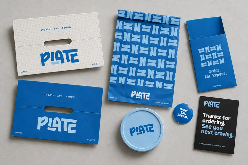
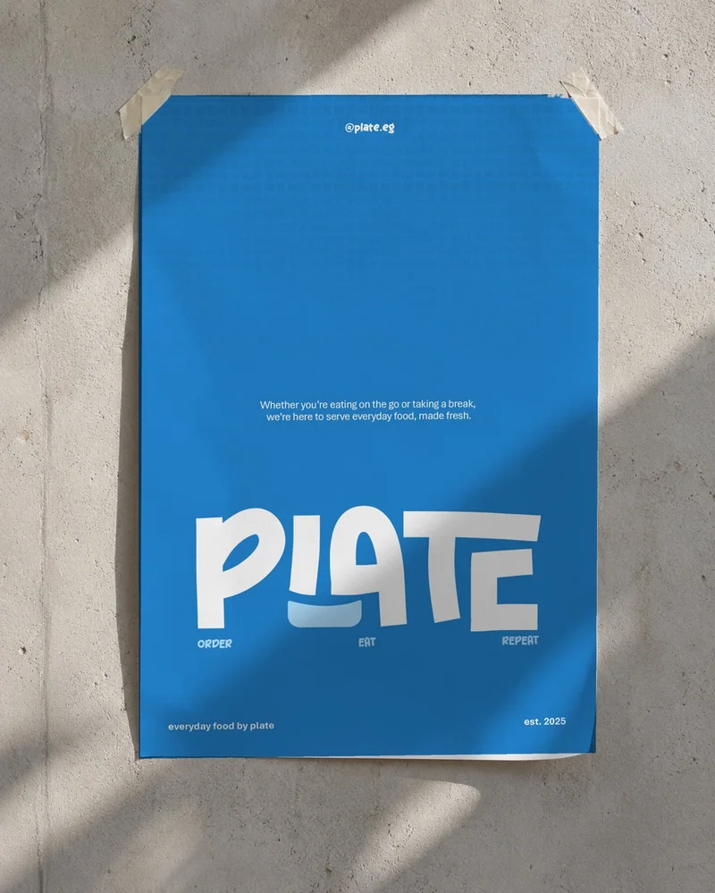
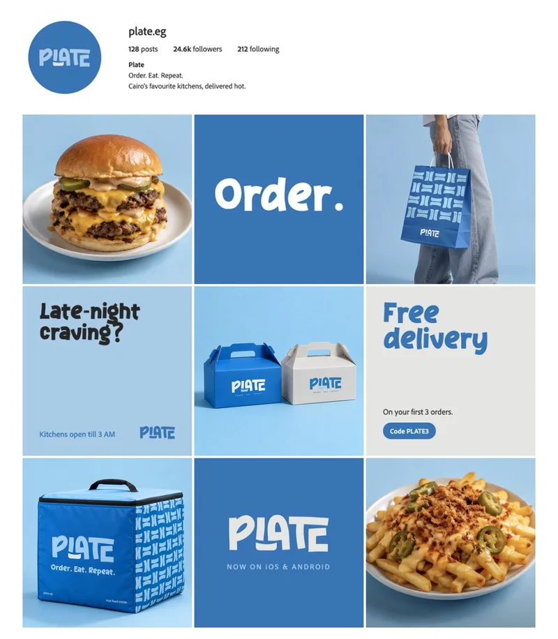
Plate delivers food across Cairo. Delivery apps all look alike on a phone screen, so the brand had to be recognisable everywhere else too: on the box, the bag and the rider's back. We built it around a chunky wordmark and one pattern that works at any size.
- Services
- branding, ui / ux
- Deliverables
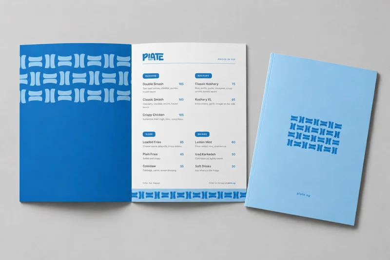
- Logo & wordmark, Pattern system, Packaging, Rider delivery box, Menus, App UI, Social templates
- Based in
- Cairo
Spotted from across the street
The wordmark is heavy, friendly and a little off-balance, the way good street food is. It has to read on a sticker, a bag and the side of a moving delivery box, so it stays simple and loud.
Order. Eat. Repeat. became the line that runs across everything.
One pattern, everywhere
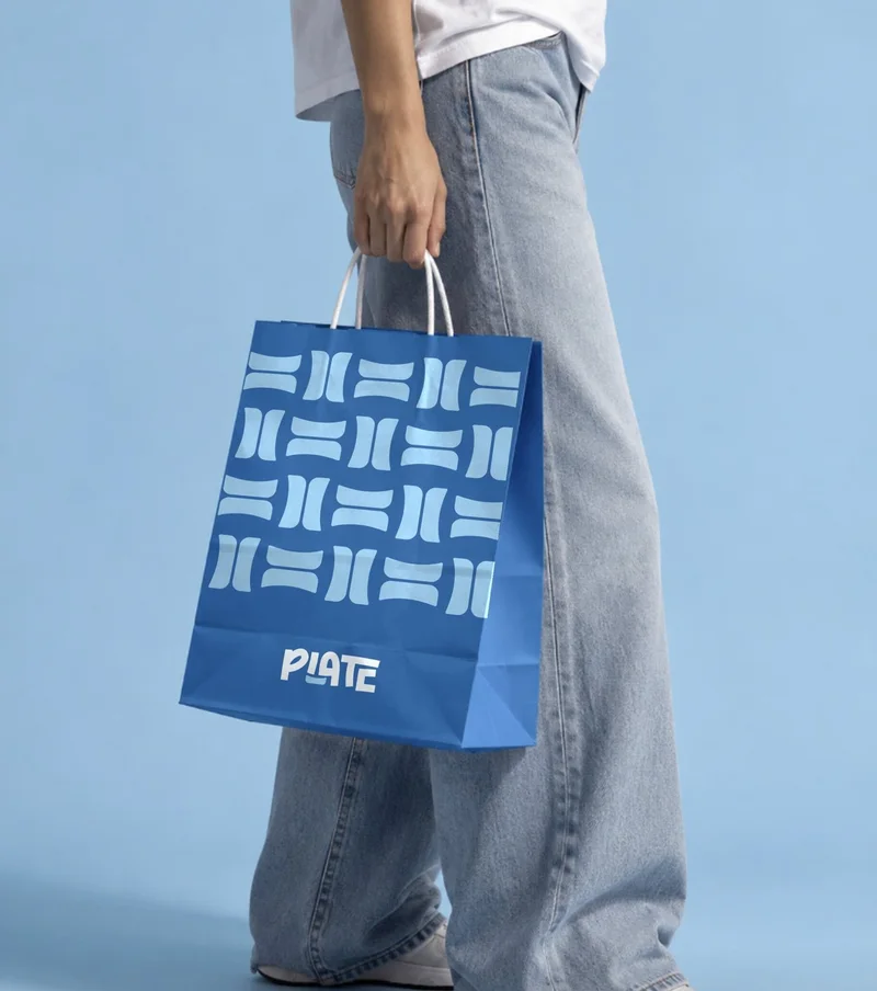
The pattern is the hardest-working part of the identity. It wraps the boxes, fills the app's food cards and covers the rider's box, so a corner of it is enough to say Plate.
Two blues do the rest: dark for the brand, light for everything around it.
- Plate blue#1B75BB
- Sky#A0CCE9
- Charcoal#262626
- Tray grey#E5E5E4
- display
- Achiko
- body
- Adobe Clean
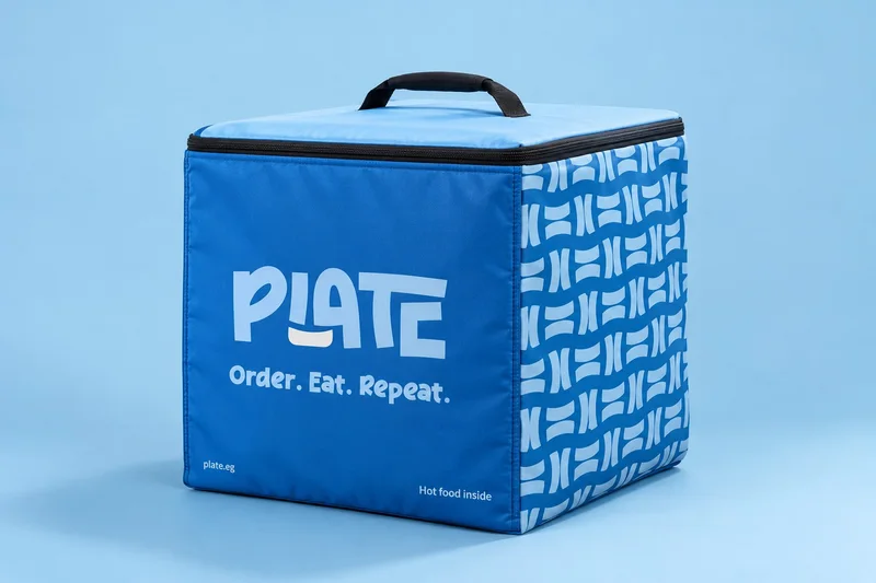
“Order. Eat. Repeat.”on every box, bag and screen
Hungry? There's an app for that
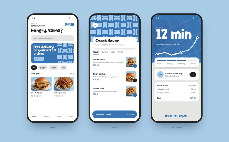
In the app, the pattern becomes food tiles and the blue becomes the buttons. Three screens carry the whole journey: pick a place, build the order and watch the minutes count down.